Trip Advisor UX Exercise
I created a mock up as an exercise to improve the experience of viewing a travel package for a high traffic travel website.
BEFORE
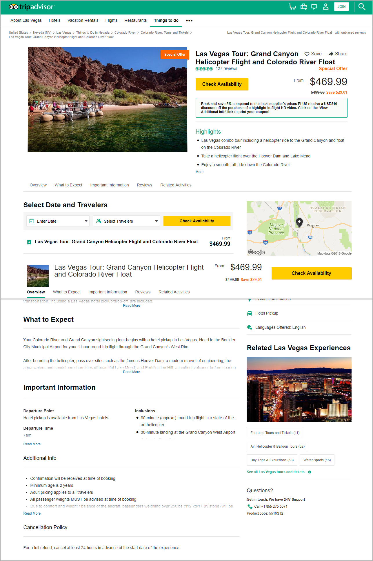
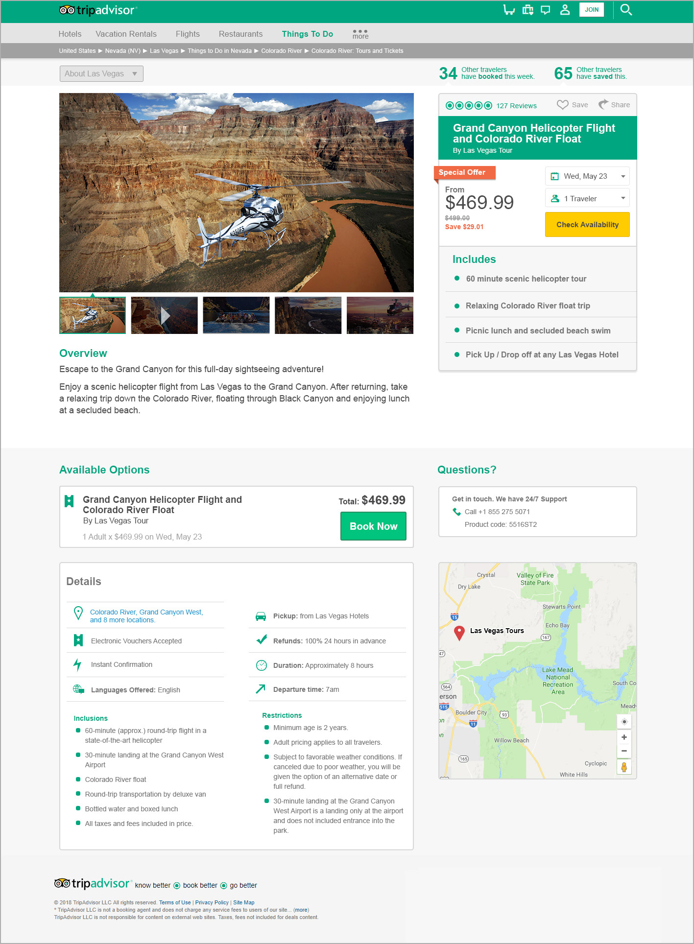
Below are screenshots from the (then) live version of an offering page on both desktop and mobile. The items below were created and are owned by tripadvisor, not myself.
ISSUES OF NOTE
Information Overload: There is an over abundance of information that is sometimes displayed in multiple locations. Arbitrary category names make it difficult to scan for what you're looking for.
Unclear CTA: The top "check availability" button scrolls the page downward to the second "check availability" button. Only there can you actually check availability.
Copy Audit Needed: There is a lot of redundant information between sections. I also feel that the wording could be more concise.
Lack of (or hidden) social proofing: We know that a big part of decision making is due to confidence in a product. While reviews are a good place to start, social proofing can help customers overcome hesitation.


AFTER v1.0
Below are the mock ups and annotations that I created and submitted as part of an interview process. We know that UX designs are never truly 'complete' - we engage users for feedback and then interpret that information in the form of wireframes and prototypes. Once vetted and developed, the designs are tested continuously to create a cycle of improvement and innovation.
This 1.0 represents my suggested first steps into improvement for the website in general, and the adventure package listings. These changes would certainly prompt some meaningful development time but well within the scope of improvement within a sprint.

