DISCOVERY & EXPLORATION
HALLWAY STUDIES & USER SURVEYS
I got an early start in gathering opinions and survey answers while also gaining as much context as I could. I'm not an insurance expert and this fact served me well as I empathized with the user. A UX designer must always serve the user in addition to the needs of the business. It's this balance that creates success.
My hallway studies and UX discovery sessions provided me with some good assumptions to begin with. In became important to keep the flow as efficient as possible because it was already on the verge of becoming tedious.
FLOW LIKE A RIVER
...don't block like a damn. I hate dead ends and confusion. It is our responsibility to educate the user to make the right selections as well as to remember that a.) they've just incurred an injury after an auto accident. This process should empower them, not add to their frustration.
After several iterations, this is the latest user flow. It accounts for a passenger loop after the user has filled out information for their own injury. A content strategist helped me to create a language flow that was simple and thought-free.
CREATION
LOW HANGING FRUIT
After each version of the flow, I followed up with a loose wireframe built in Sketch. I used the existing style conventions and templates for rapidity.
However, doing so made me aware of some opportunities for improvement.
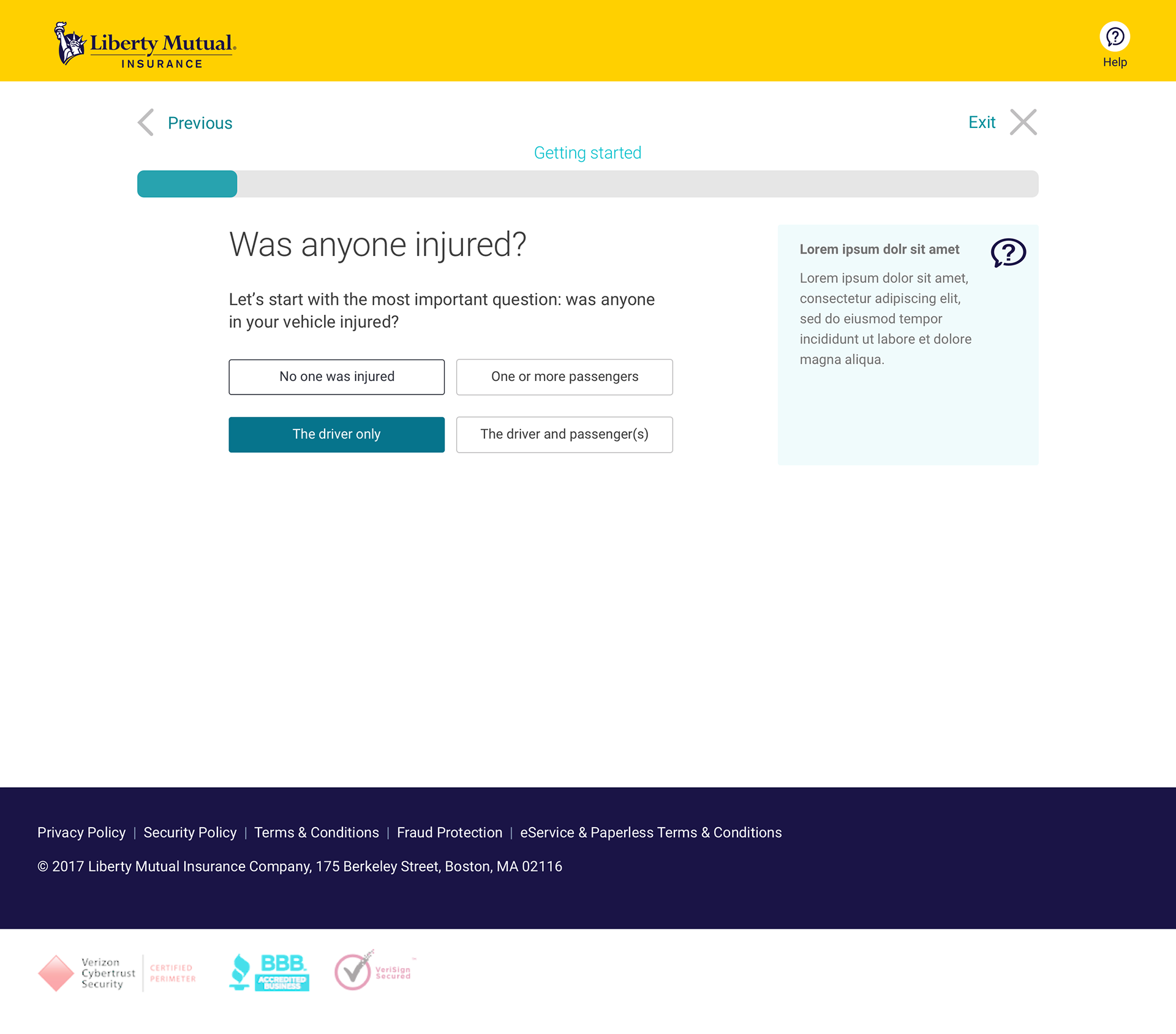
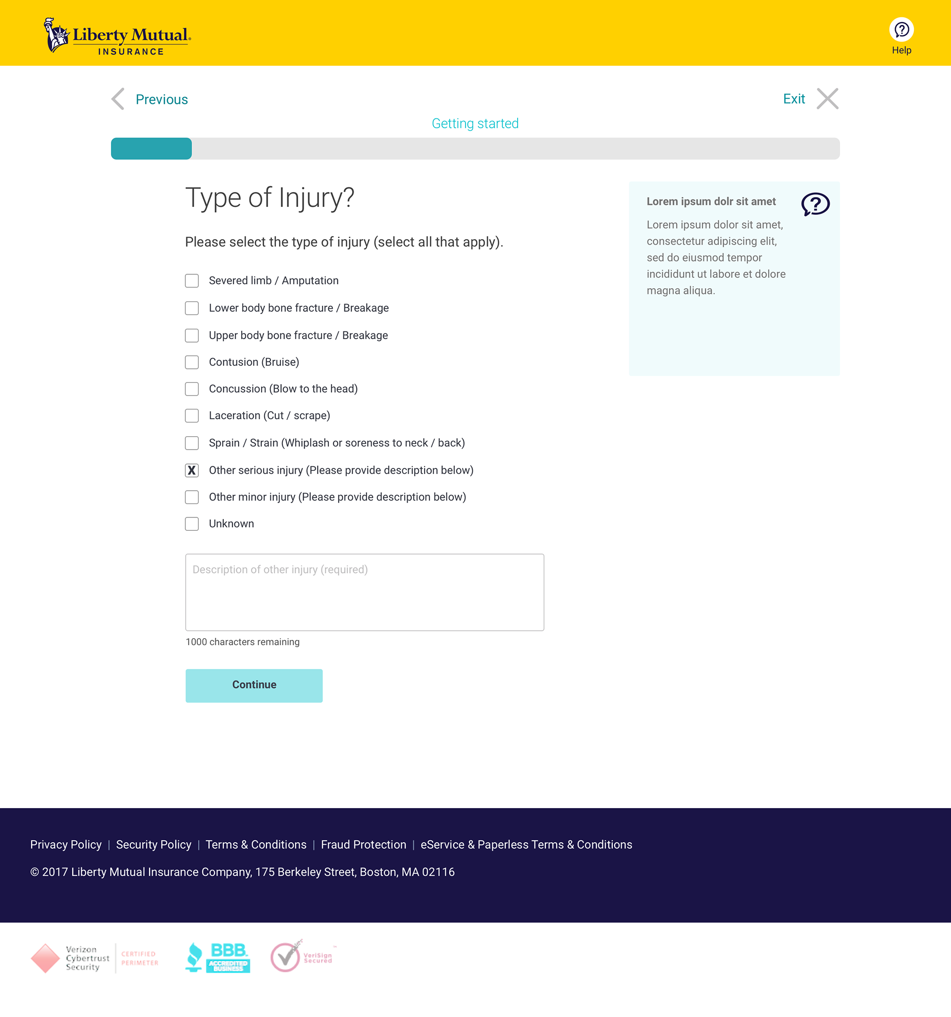
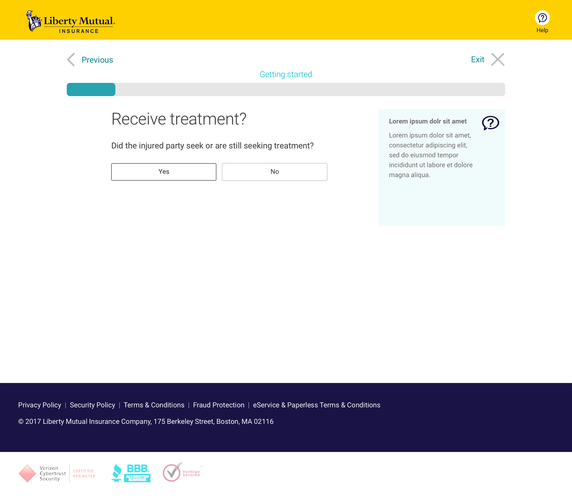
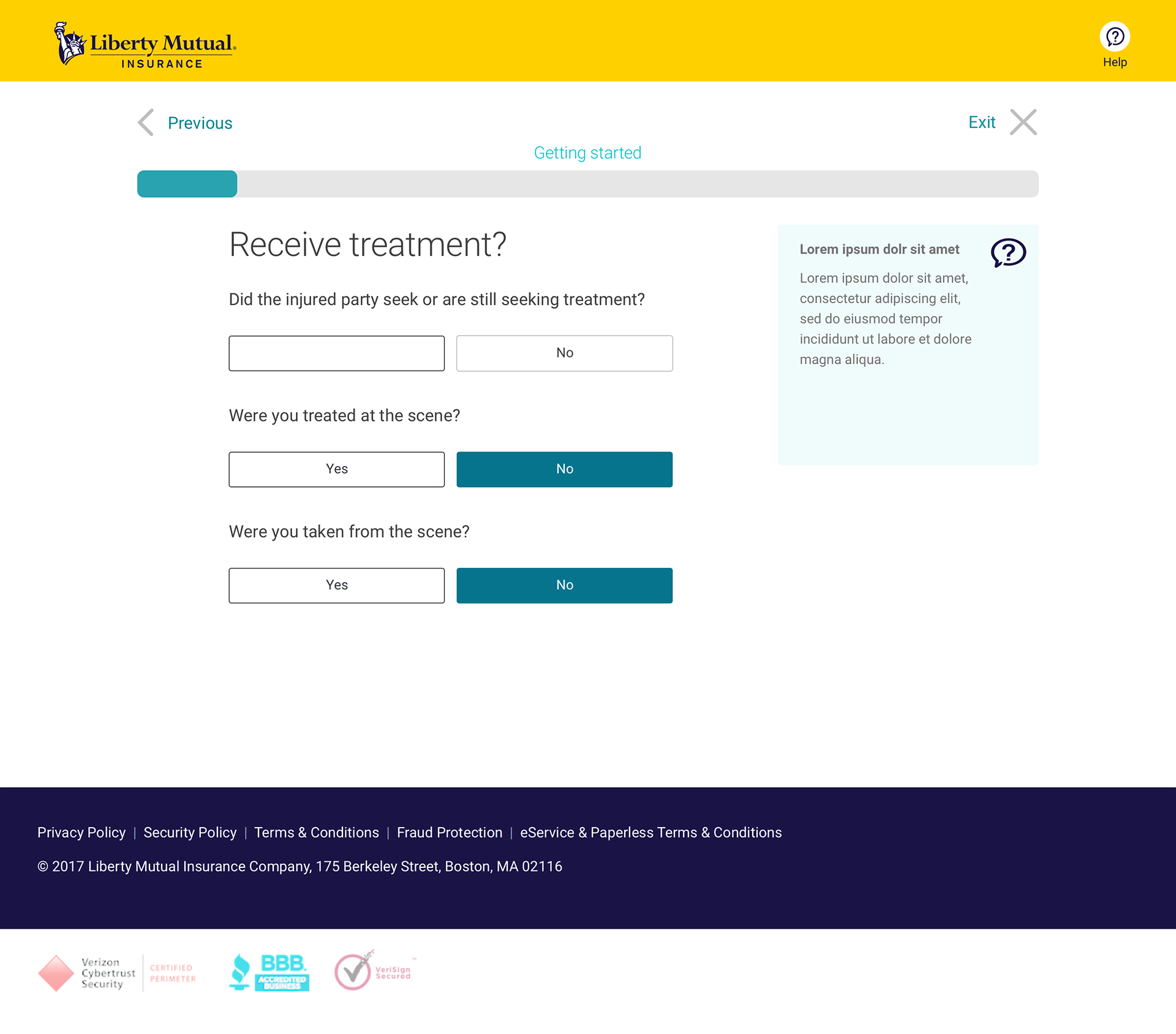
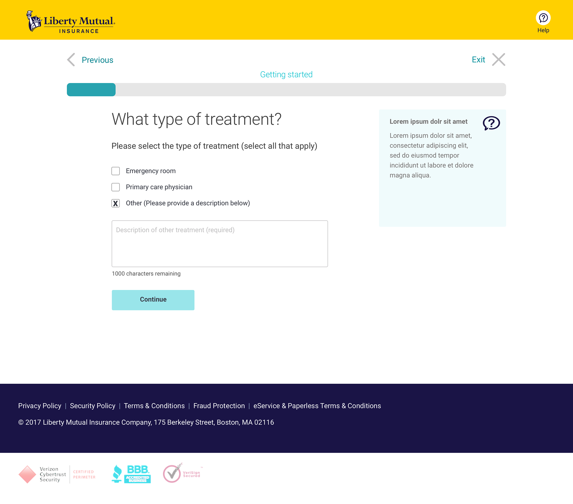
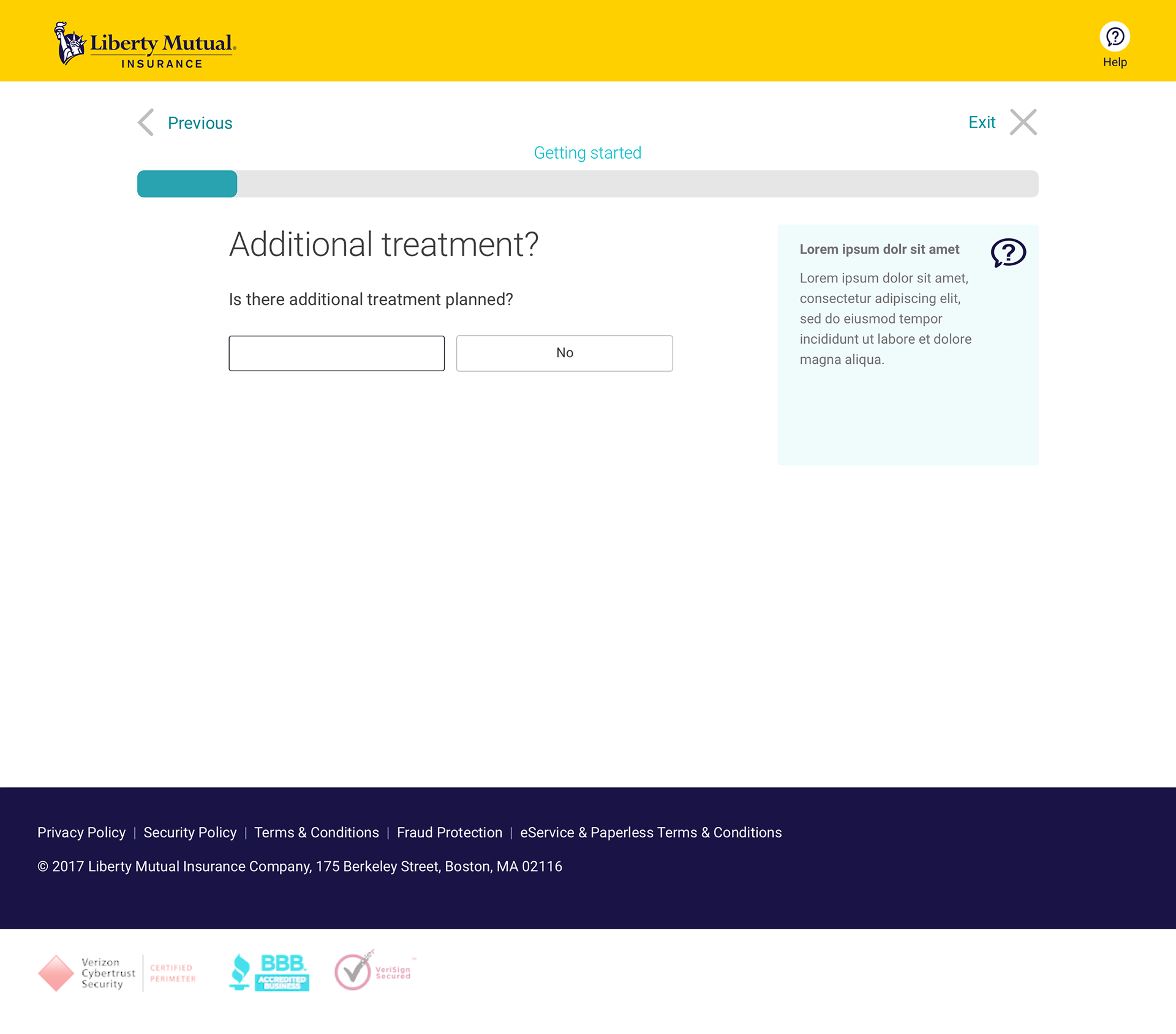
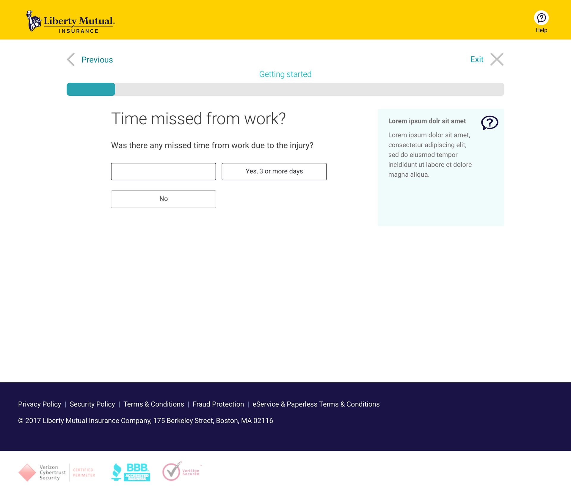
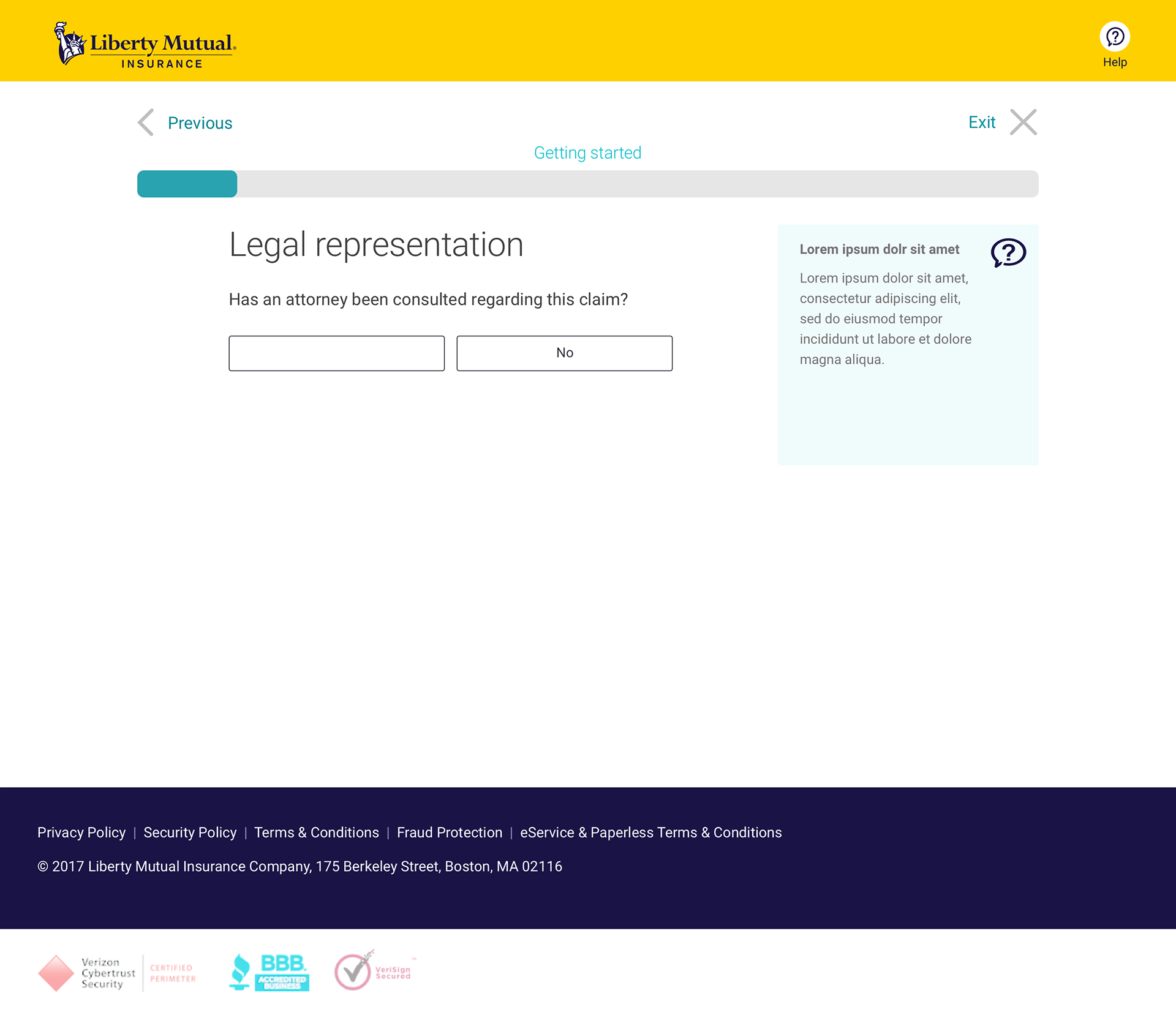
Below, is a wireframe based on the flow using an outdated version of the design system...


ROOM FOR IMPROVEMENT
My issues with the above version of the design was two fold: Firstly, the 'right rail' was taking up room that I thought could be used more effectively. The information contained within could be integrated into the main copy.
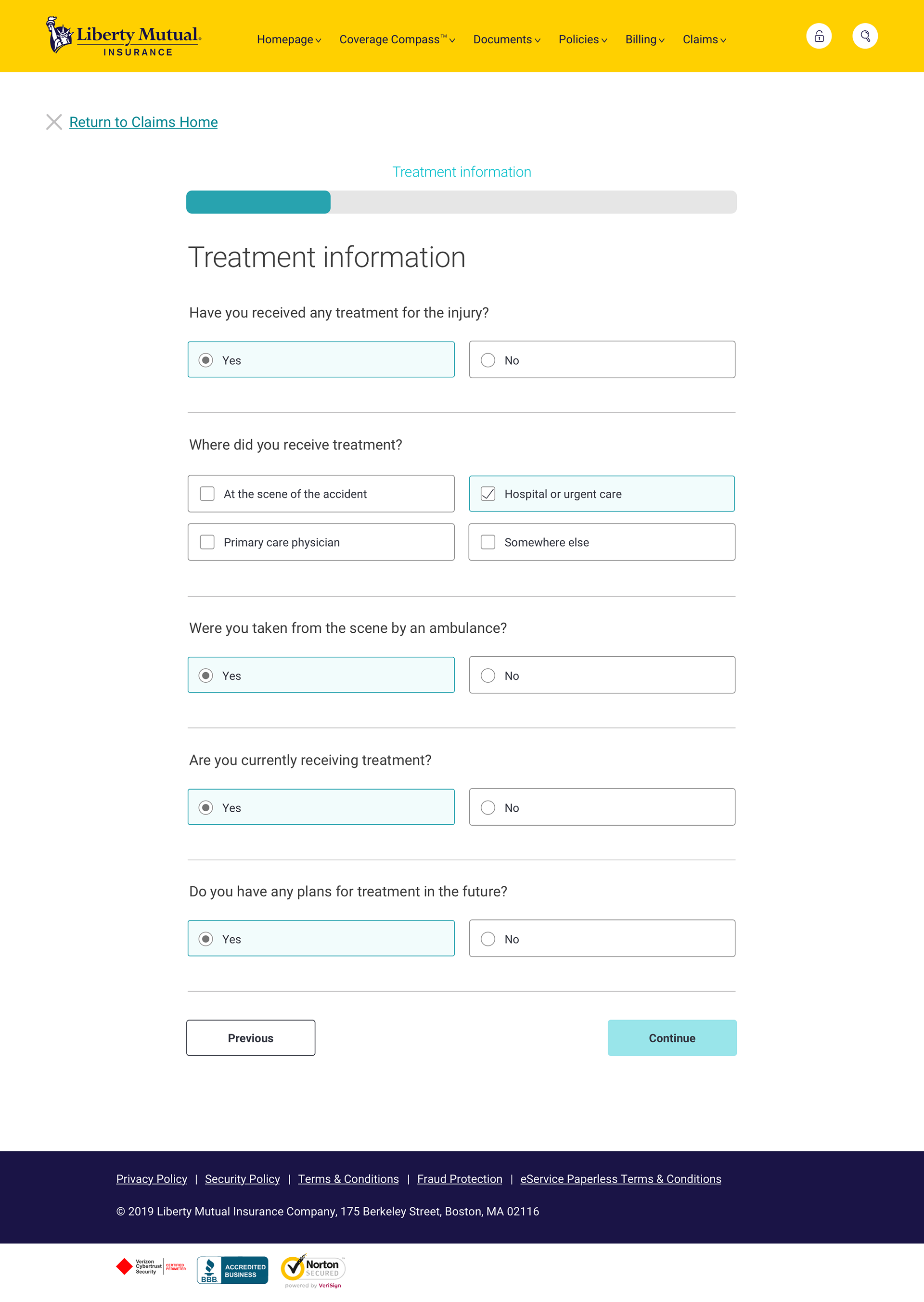
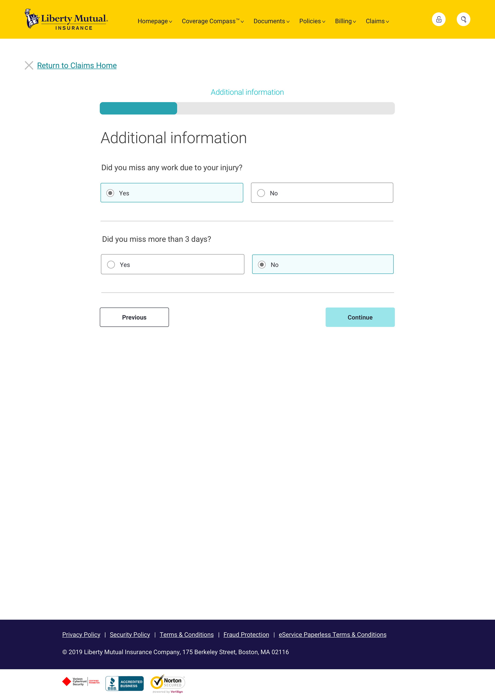
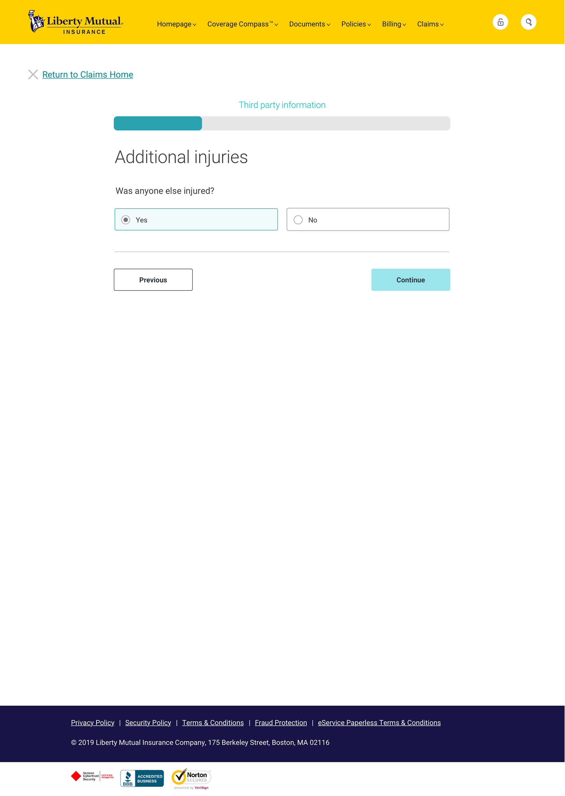
The other thing that stuck out to me was the method of selection and continuation. The use of buttons for what, to me, is a radio button selection aligns more with best practices as well as accessibility requirements.
To the right and below is my version of these pages using some stylistic improvements.
PASSENGERS
Ideally, we could gather passenger information in the same way. But since there's a technical limitation currently that prevents us from displaying review information, I had to advise against creating this loop. Imagine driving a van with nine passengers. Me personally, I would forget who I added after about four passengers and have to start over or, more likely, call my agent.
One of my first ideas (not my best one, I admit) was to combine all of the questions into a single 'worksheet'. The result is a very long form (which did not perform well in my surveys).
The compromise for this first round of development was to create a simple questionnaire that would gather very basic information that would result in a follow up call.
We could also give the claimant the opportunity to fill out a really long form (a combination of all of the questions already asked). I'm not showing that here because it's crazy long.
Simple information collection for passengers
FUTURE VERSIONS
ALL IN ONE
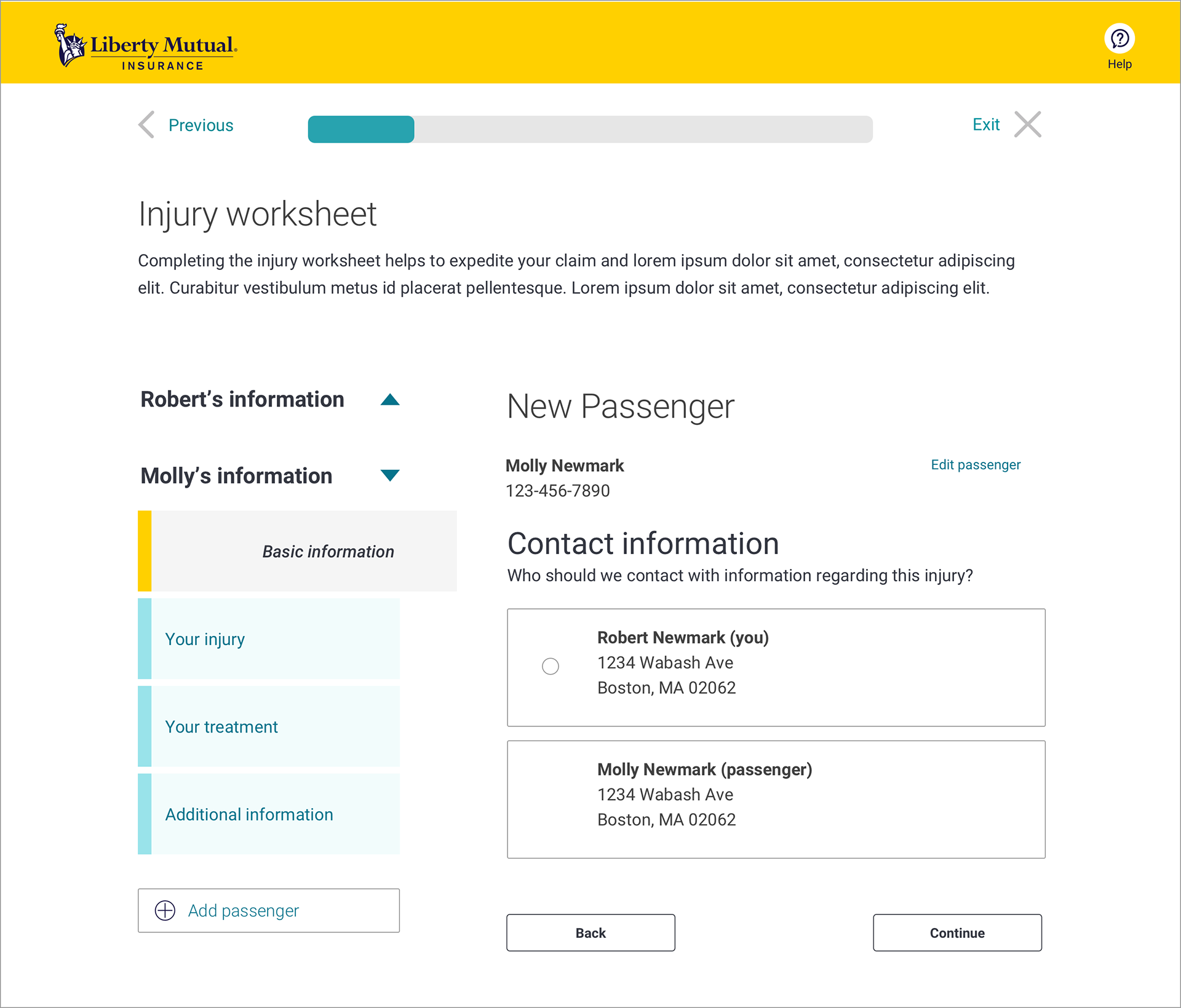
This is an exploration of an idea that would combine the claimant injury worksheet and 'review and submit' page. This idea is still very half-baked but I'm encouraged by some of the feedback I've received and the possibility of improving the filing process throughout the various portfolios within the company.
All in one injury worksheet
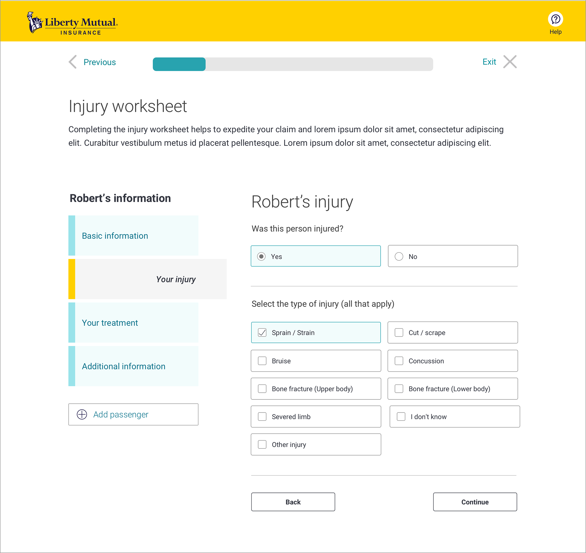
Injury information
