OVERVIEW
This is an enhancement for an existing product that allows a third party claimant to check on the status of their auto claim against a Liberty Mutual customer.
Story
"As a third party user (using our default persona) I want to quickly gain access to important information regarding my auto claim."
Current Problem
This effort would seek to increase the adoption of the third-party claim management tool by offering an easier way to check on information without being overloaded with data.
Challenges
The amount of information that we present to the user is constant and required. We don’t want to limit what we present them with but we want to try and highlight those things that are the most important.
Assumptions
Friction is caused by the overwhelming presentation of insurance information causing a user to abandon the self-service portal in favor of calling an agent. I believe that most customers basically wants to know a few things and if there’s anything they can do to hurry the process up. They aren’t looking to become insurance experts.
Strategy
Using the existing framework, create enhancements that present important information at a glance without needing to dig for it. Conduct surveys to figure out what information is most important to customers in this position and gather any other feedback that seems helpful to this end.
My Concept for At-A-Glance Info
Success
A significant reduction in calls from registered third-party customers asking for status on their claim after first visit should be considered a success. Liberty Mutual also conducts automatic exit surveys on a drop off, so we can also include a reduction in complaints surrounding hard to find information.
My Role
I adapted the existing display of third-party information to include enhancements using Sketch, prior research regarding the use of progress indicators, and input from the greater UX team. I also presented my ideas to the stakeholders in charge of this product.
PROCESS
Discovery
Run unmoderated user surveys to determine what customers consider “important information”.
Conduct a discovery session with UX team to come up with ideas to provide customers with that valuable information and determine the feasibility of adding those features into the product during a current sprint.
Decide which features could be added to a backlog if needed.
Conduct a discovery session with UX team to come up with ideas to provide customers with that valuable information and determine the feasibility of adding those features into the product during a current sprint.
Decide which features could be added to a backlog if needed.
Creation
Since all of the information exists in one page, I didn’t do a wireframe flow. I created a template based on the production version of the page in Sketch, aligning everything to the updated grid and using the latest design system components.
I created a couple variations based on widening scope. That is, a “currently feasible” version and a “future innovation” version that presented further, valuable enhancements that are possible given more time.
Status page with Claim Details expanded
Feedback & iteration
I presented my designs and their variations and gathered feedback from several teams – my UX peers, the design system team, and stakeholders. Based on accumulated feedback and further testing (unmoderated surveys to gauge preference), I refined my design variations.
RESULTS
Lessons & findings
There were a lot of assumptions regarding what information a customer most wants to see on a status page and it was useful to receive validation on those things.
We learned that the most important things to these third-party customers were “Do you need anything from me right now?”, “where is my car?”, “who do I contact with questions?”, and “When will I get paid?”.
A lot of prior research showed that some kind of “big picture” progress indicator was valuable and our new research showed the same thing. They want a “you are here” map to show what steps have been completed, what steps they need to take right now, and what’s next.
I had tinkered with the idea of removing a lot of the details from the initial page, showing *only* a digest of the “important” information and it didn’t test well at all. It was important for a customer to be secure in the knowledge they have access to all that information even if they aren’t going to use it. It’s presence is reassuring and adds a perceived value that was important to them. So I made to sure to include it and only work on creating a visual hierarchy.
All accordions expanded - I rearranged the existing information to remove redundancy and try to make the dense information less intimidating.
Next steps
I introduced some features that, try as I did, just don’t exist in its current form. Development needs to parse the details for the “at a glance” information and display that data on the card in a useful manner.
BEFORE
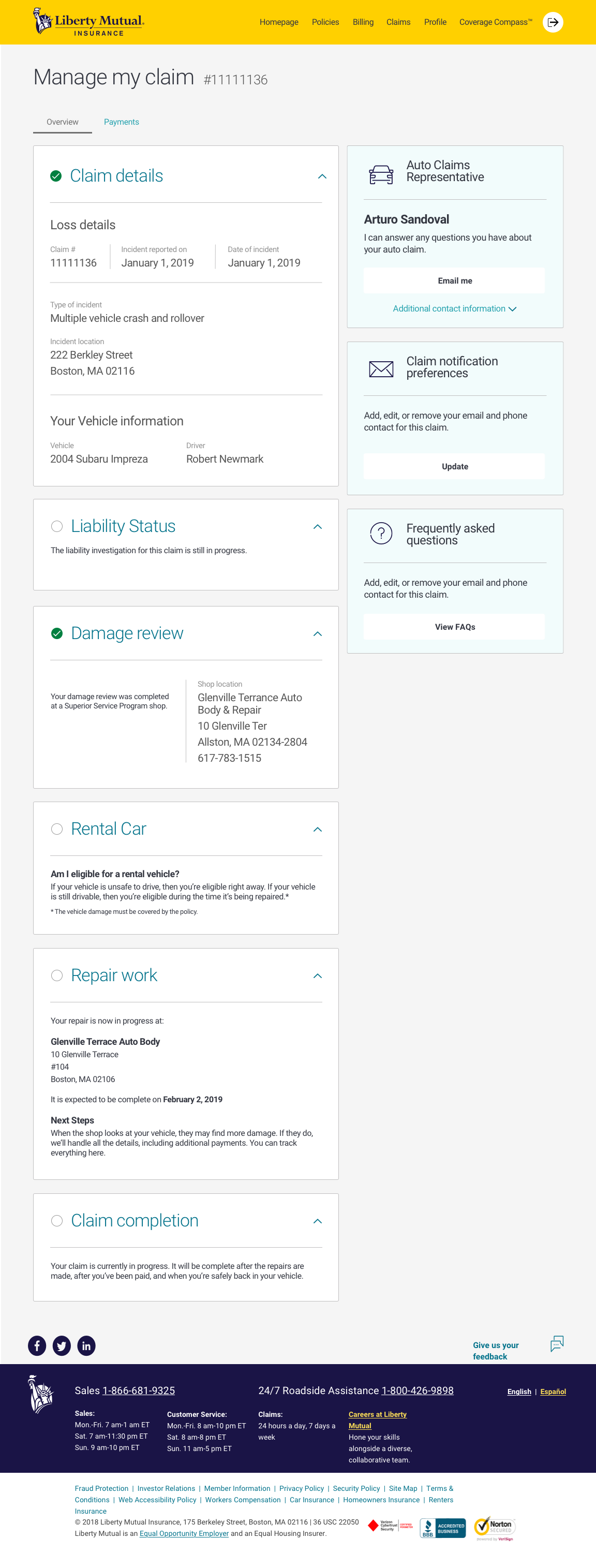
As an example, here's the original claim status page.
Issues
The meaning of the check marks are somewhat ambiguous. The blocks aren't necessarily chronological and don't always mean "complete".
The default view of this page is to have all of the boxes expanded, presenting the user with a deluge of information all at once.
Some blocks, like "Rental Car", aren't able to display user information but doesn't have a clear call to action.
It was confusing and redundant that "Damage Review" and "Repair Work" were in separate blocks.

AFTER
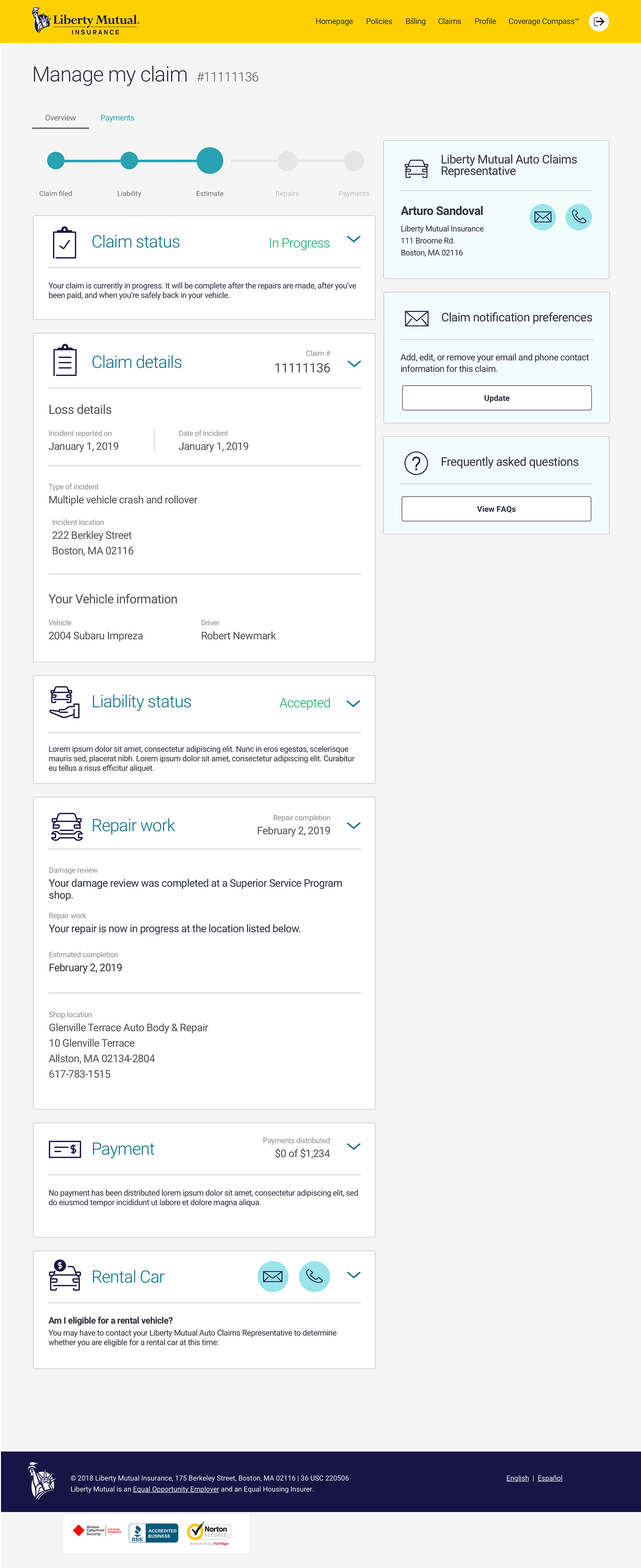
Here are my suggested improvements.
Notes
I added a simple road map at the top so the customer can immediately see where they are in the process.
The page opens with all boxes collapsed. Any key information available is immediately noticeable. Full details are a click away.
I added easy to spot links for contacting the representative and the rental car agency.
Any errors or required actions would be displayed by the use of color and icons, accompanied by descriptive text for next steps.


Next steps
I introduced some features that, try as I did, just don’t exist in its current form. Development needs to parse the details for the “at a glance” information and display that data on the card in a useful manner.
The MVP for this project is to improve the organization of the page within the scope of development concerns as well as paving the way for the added features.